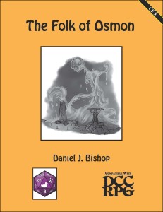
 Author: Daniel J. Bishop
Publisher: Purple Duck Games
Art: Gary Dupuis, Luigi Castellani
Price: PDF $3.00 – at RPGNow / at d20pfsrd.com / Paizo.com
Pages: 14 (incl. cover)
The Folk of Osmon is the third, and as of this post, the most recent release from Purple Duck Games in the new Campaign Elements line. For those unfamiliar with the Campaign Elements line, it is a new series of products written as short scenarios ready to be dropped into an existing campaign. The scenarios offer possible questing locations, side treks, or possibly a place for a wizard to gather a new spell component. So far each scenario has offered several ideas as to how to work it into a campaign.
The module is written by Daniel Bishop and illustrated by Luigi Castellani. The PDF comes in at 14 pages including the cover and OGL license information at the back. A map of the area is included, as well as a couple of art pieces, one of which is in color. Several new monsters are presented along with a random encounter table for the area. Four scenario possibilities are at the end of the adventure to help a busy judge jumpstart some ideas on how to incorporate The Folk of Osmon in their home campaign.
The Folk of Osmon is intended as a hazard area and is located in a mire. This helps make it relatively easy to use in most campaigns. The four suggestions at the end of the module are helpful for judges having a hard time determining how to introduce their players to the area. For Purple Sorcerer fans, this particular Campaign Element screams to be dropped into the Sunken City area!
Hooks into the scenario range from simply passing through the area, rescuing an NPC from a sacrifice, finding possibly hidden treasure, to encountering a ritual in the swamp, or any number of other possibilities a creative judge can come up with. By aiming to be a hazard area with some interesting traits and occupants the transportability of the adventure has few limits.
The Review
The Campaign Elements series continues to deliver with this third installment. Given I have my currently running campaign based in a city bordered by an expansive swamp to the south, it makes it exceedingly easy to drop this one into my game. So far that has been the case for each of the Campaign Elements series released, I have no trouble thinking of places I can use them.
The adventure includes four more creatures that are apt to be found near the area. One called a Pallid Thorn has an interesting attack that is sure to play with player’s minds. The other creatures easily fit into a swamp environ and will certainly see use in my campaign.
The actual encounter area has five areas within a set of ruins is described. I find the number of areas described enough to give the judge a feel for the area without being enough to side track a party for too long if the area is dropped in as a place the party is just passing through.
The inclusion of four ways to drop this encounter area into your campaign is a nice touch. The hooks here are more than just a one or two liner, but several paragraphs worth of setup to help make the area even more interesting or tied to the characters.
I noted above one of the pieces of art included in the adventure was in color. That was a nice touch for the module! I am used to the black and white pieces in a lot of the Purple Duck Games releases for DCC. It was good to see a little color in there.
The Campaign Elements line continues rolling on strong with this third release. I feel like with a collection of these I can always have something ready to run for my group or something to pull out when they need to quest for something. With an easy to use hazard area, new monsters to drop into any swamp in your campaign, and several suggested hooks to use this area of ruins, The Folk of Osmon is another excellent addition to a judge’s collection.

Gary Dupuis is the artist responsible for the ooze queen art on the cover and interior. I’ve recently been playing around with colour art for our DCC releases but always kind of felt B&W felt more appropriate.
I corrected the artist credits in the post!
I liked the color art, but I can also see where you are coming from with the B&W feel.